If you have been a Mac user for more than a week, you know the struggle of the “Sea of Blue.” You create a folder for work, a folder for family photos, a folder for taxes, and another folder for miscellaneous junk you will never look at again. Eventually, your desktop and Finder windows become an endless grid of identical blue icons. Trying to find the right project feels like searching for a needle in a digital haystack.
But as of the latest macOS Tahoe updates in the summer of 2026, Apple has finally given us the cure.
With the introduction of the new “Liquid Glass” design language, macOS has completely overhauled how we organize our workspaces. You are no longer stuck with the default blue. Here is everything you need to know about customizing your folders, tinting your app icons, and turning your chaotic Mac desktop into a visually organized masterpiece.
Understanding the Liquid Glass Aesthetic
Before we start painting your folders, it helps to understand what macOS Tahoe is actually doing behind the scenes. Liquid Glass is Apple’s new overarching design material. It is a dynamic, translucent UI layer that acts like real glass. It reflects your wallpaper, refracts light, and automatically shifts its shading based on whether you are using Light or Dark Mode.
This means that when you apply a color to a folder or an app icon, it does not just look like a flat sticker. The colors are baked into multiple layers of this virtual glass, giving your icons a gorgeous, shimmering depth that reacts when you drag them across your screen.
“Liquid Glass brings a physical dimension to your digital workspace. It is less about making things look pretty, and more about creating a visual hierarchy that your brain can process instantly.”
How to Customize Your Folders
Apple has natively integrated folder customization directly into the operating system. You no longer have to rely on complicated workarounds or third-party image editors to change a folder icon.
Here is how you can instantly customize any folder on your Mac:
- Select the Folder: Right-click on any folder on your desktop or inside Finder.
- Access the Customizer: Select the new “Customize Folder” option from the context menu.
- Pick Your Color: A new Liquid Glass panel will appear. You can choose from a massive palette of preset colors, or use the color picker to match a specific hex code for your brand or project.
- Add an Emblem or Symbol: Beyond just color, you can stamp a glyph directly onto the folder. You can choose from hundreds of native Apple SF Symbols, or even stamp a standard text character on the front.
- Save and Marvel: Click apply, and watch your boring blue folder morph into a customized, translucent piece of glass.
For example, you could make your “Finances” folder a deep, translucent green with a dollar sign symbol, and your “Video Projects” folder a bright red with a play button emblem. Your brain will recognize the color and shape milliseconds before you even read the folder name.
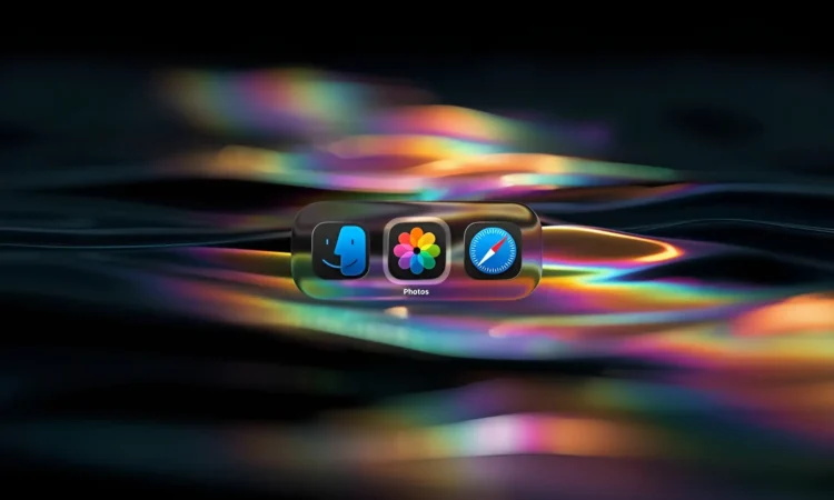
The “Clear” App Icon Revolution
Folders are only half the battle. Your app icons can also get the Liquid Glass treatment. Apple unified the icon design across iOS, iPadOS, and macOS Tahoe, meaning the tinting features you love on your iPhone are now on your Mac.
If you want a truly minimalist desktop, you have to try the new “Clear” variant.
By right-clicking your desktop and going to the view options, you can change your app icons from their default colors to a completely transparent, clear glass look.
| Icon Style | Best Used For | Visual Effect |
| Default | Standard recognition | The classic, multi-colored look we are all used to. |
| Dark Variant | Late-night working | Swaps bright white backgrounds for deep blacks and dark grays. |
| Tinted | High-contrast organization | Washes all icons in a single, unified color of your choice. |
| Clear | Minimalist desktop setups | Strips the color entirely, leaving only the shape of the app etched in clear glass that blends into your wallpaper. |
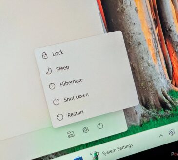
A Quick Note on Hardware and Readability
As beautiful as the Liquid Glass interface is, all of that real-time blurring and refracting requires some processing power. macOS Tahoe is notably the final operating system that will support Intel-based Macs. If you are running an older Intel machine from 2019 or 2020, you might notice your fans spinning up when you have a screen full of customized, translucent folders.
Additionally, some users find that heavily tinted glass makes text labels harder to read in bright sunlight.
If you run into either of these issues, there is an easy fix. Simply navigate to your System Settings, open the Accessibility menu, and look for the Display section. You can easily adjust the “Reduce Transparency” slider to tone down the Liquid Glass effect, giving you solid colors that are easier on your older hardware and your eyes.
Say goodbye to the Sea of Blue. Take ten minutes today to color-code your most important folders, and enjoy a workspace that actually works for you.


